When it comes to designing a restaurant, color plays a crucial role in creating the right atmosphere for your customers. A well-designed color scheme can set the tone for your customers’ dining experience and evoke specific emotions, creating a comfortable and inviting environment.
In this article, we’ll explore the different color schemes you can use to create the perfect ambiance for your restaurant and help you understand how each color affects your customers’ experience.
Understanding Color Psychology
Color psychology studies how different colors affect our emotions and behaviors. Color has the power to influence our moods, thoughts, and actions, and it can also impact our physiological reactions, such as heart rate and blood pressure.
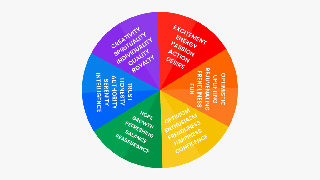
Colors can be divided into warm and cool tones. Warm colors, such as reds, oranges, and yellows, are known to evoke feelings of excitement, passion, and energy. Cool colors, such as blues, greens, and purples, tend to be more calming and relaxing, creating a sense of tranquility and serenity.
-
Using Warm Colors in Your Restaurant
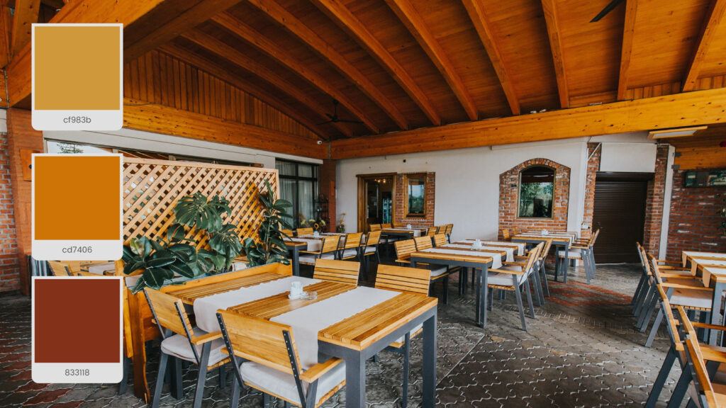
Warm colors are ideal for creating a lively and energetic atmosphere in your restaurant. They can also stimulate appetite and encourage customers to order more food. However, it’s important not to overuse warm colors as they can also create a sense of chaos and overwhelm.
Here are some tips for using warm colors in your restaurant:
1. Use red to create a sense of excitement and passion:
Red is a bold, attention-grabbing color that can stimulate appetite and create a sense of urgency. However, using red sparingly is important, as it can also create a sense of tension and stress.
2. Use orange to create a warm and inviting atmosphere:
Orange is a warm and welcoming color that can create a sense of comfort and familiarity. It’s an excellent color for casual dining environments, such as cafes and brunch spots.
3. Use yellow to create a cheerful and upbeat atmosphere:
Yellow is a bright color that can evoke feelings of happiness and optimism. It’s a great color to use in fast-food restaurants and other quick-service environments.
-
Using Cool Colors in Your Restaurant
Cool colors are ideal for creating a calming and relaxing atmosphere in your restaurant. They can also create a sense of sophistication and elegance. However, it’s important not to overuse cool colors as they can create a sense of detachment and aloofness.
Here are some tips for using cool colors in your restaurant:
1. Use blue to create a sense of tranquility and serenity:
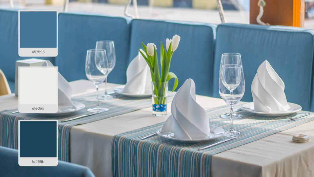
Blue is a calming and soothing color that can create a sense of relaxation and peacefulness. It’s a great color to use in fine-dining restaurants and other upscale environments.
2. Use green to create a natural and organic atmosphere:
Green is a refreshing and rejuvenating color that can create a sense of harmony and balance. It’s a great color to use in vegetarian and health-food restaurants.
3. Use purple to create a sense of luxury and opulence:
Purple is a regal and elegant color that can create a sense of sophistication and glamour. It’s a great color to use in high-end restaurants and other upscale environments.
-
Creating a Balanced Color Scheme
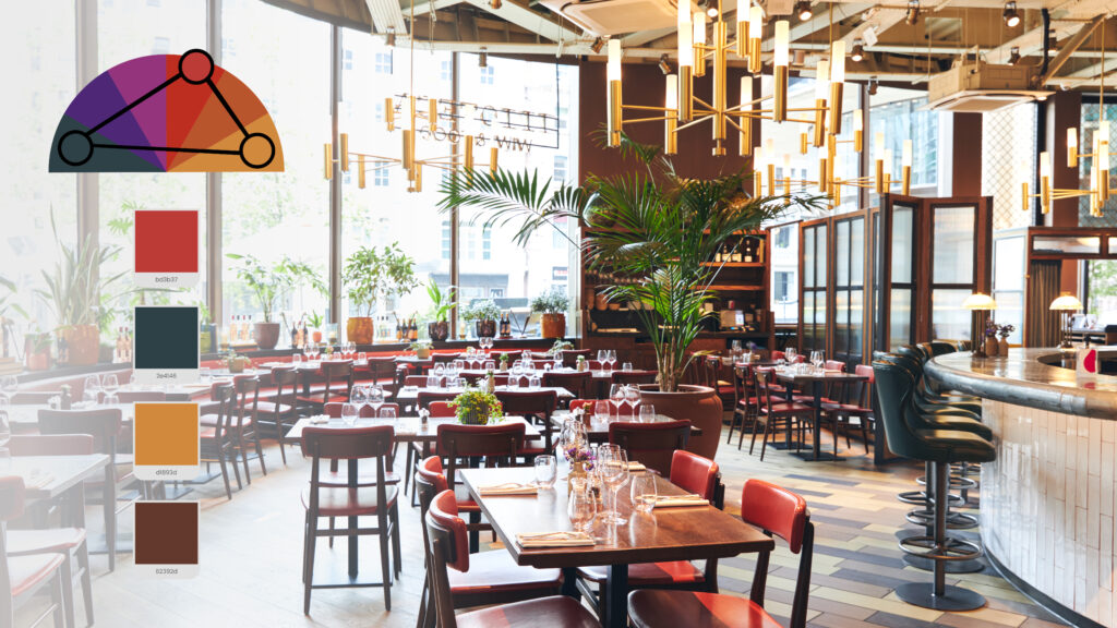
While warm and cool colors can create specific moods and emotions, it’s important to create a balanced color scheme that combines warm and cool tones. A balanced color scheme can create a sense of harmony and balance, making your customers feel comfortable and at ease.
Here are some tips for creating a balanced color scheme:
1. Choose a dominant color:
To start off, it’s important to choose a dominant color for your space. This will be the color that is most prominent throughout the room and sets the overall tone. Generally, you’ll want to choose a color that is calming and neutral, such as gray, beige, or white. This will provide a solid base for the other colors in your scheme to build off of.
2. Use complementary colors:
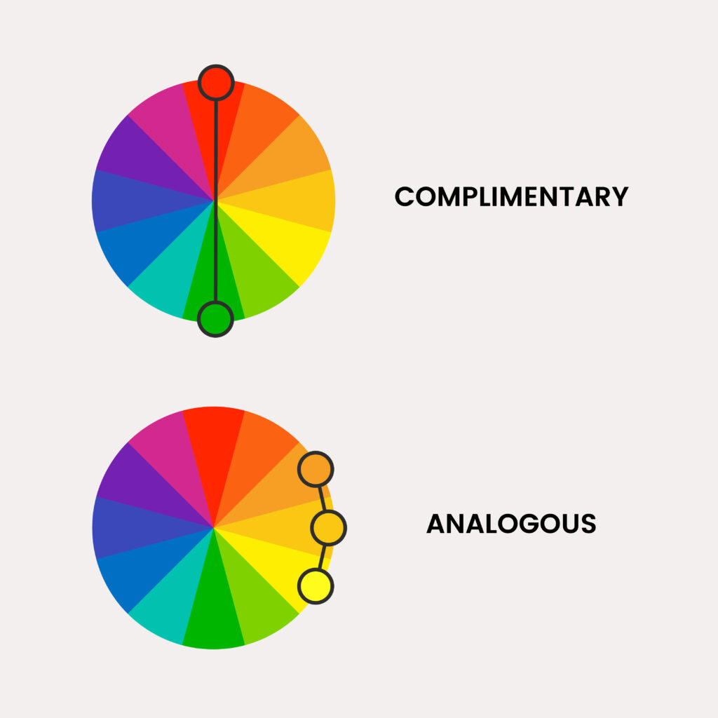
Once you have your dominant color chosen, you can start to add complementary colors to the mix. Complementary colors are those that are opposite on the color wheel, such as blue and orange or red and green. Using complementary colors in your scheme can create a sense of balance and harmony while still providing visual interest.
3. Consider analogous colors:
Another option for creating a balanced color scheme is to use analogous colors, which are those that are adjacent to each other on the color wheel. This can create a more subtle and cohesive look, as the colors will naturally flow together. For example, choose a range of blues and greens for a calming and serene space.
4. Use the 60-30-10 rule:
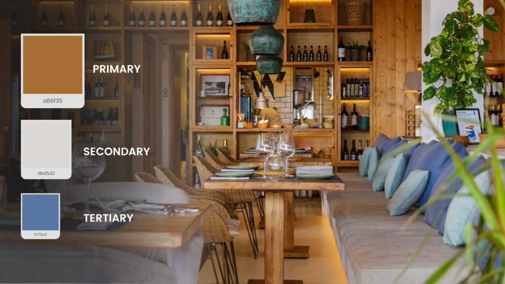
A helpful guideline for balancing colors in a room is to use the 60-30-10 rule. This means using your dominant color for 60% of the room, a secondary color for 30%, and an accent color for 10%. This can help to ensure that your colors are proportioned correctly and don’t overwhelm the space.
5. Consider the mood you want to create:
Finally, it’s important to consider the mood you want to create in your space when choosing colors. For example, if you want to create a calming and relaxing atmosphere, you might choose soft blues and greens. On the other hand, if you want to create a bold and energetic space, you might choose bright and vibrant colors like red or orange.
Key Takeaways:
Choosing the right color scheme is a crucial element of creating the right atmosphere for your restaurant. By following the tips outlined in this article, you can create a balanced and visually appealing color scheme that sets the right tone for your space and leaves a lasting impression on your customers.
Whether you choose to use complementary or analogous colors or follow the 60-30-10 rule, remember to consider the mood you want to create and use colors strategically to achieve your desired effect. With a carefully curated color scheme, you can create a warm and welcoming environment that keeps customers coming back for more.


Leave a Reply